
0.1 Protract Your Organization
This document outlines essential security protocols in an accessible, easy-to-follow format. I designed the cover using a modular grid system.
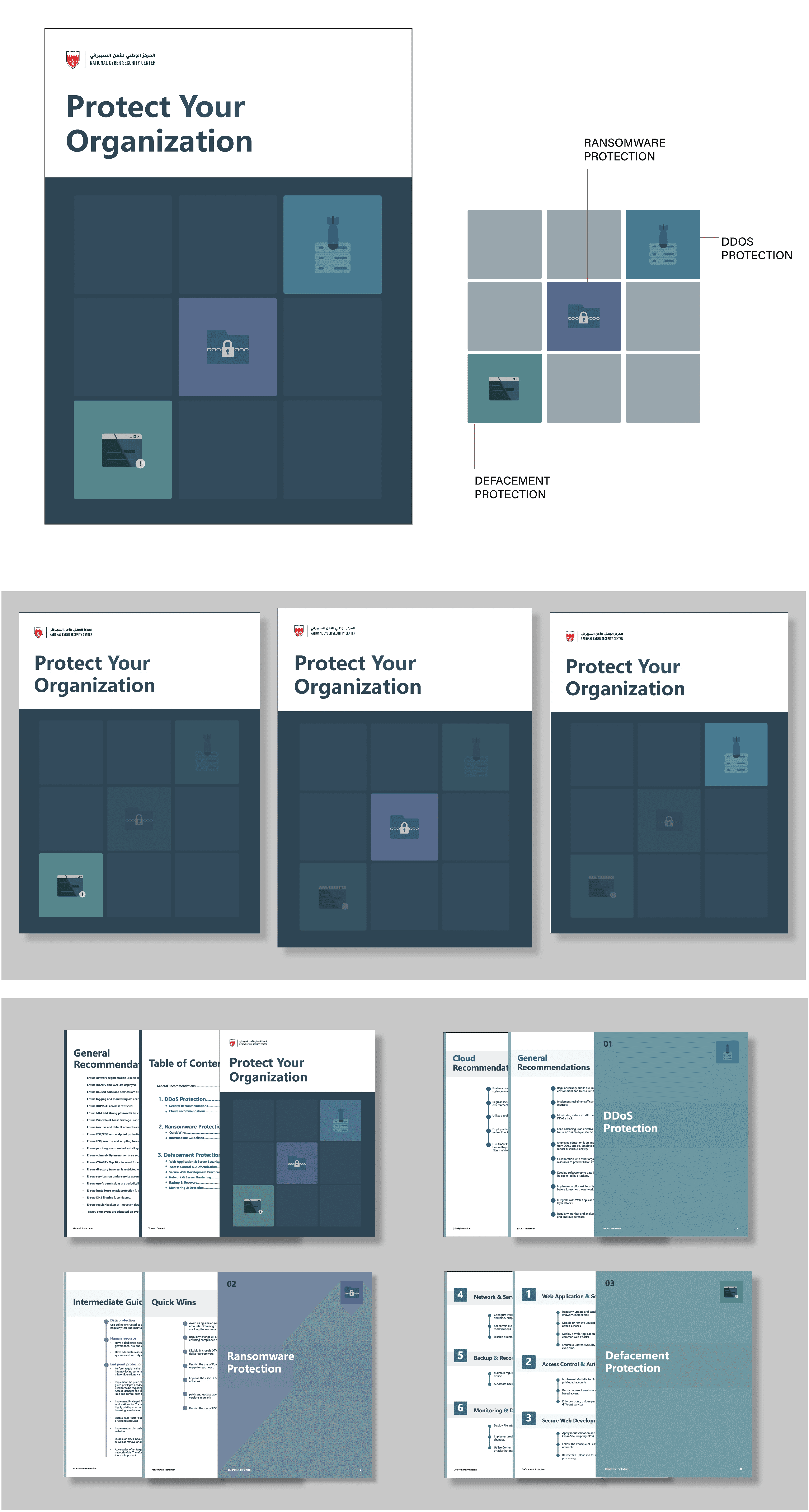
My research showed that the NCSC often needs to issue either a single protection guide or multiple guides at once. To address this, the cover is designed for maximum flexibility; sections can be added, removed, or sent individually while maintaining a consistent visual identity. This allows the NCSC to effortlessly update instructions for new threats while keeping the design professional and functional
0.2 Vulnerabilities & Threat Advisory

Color system
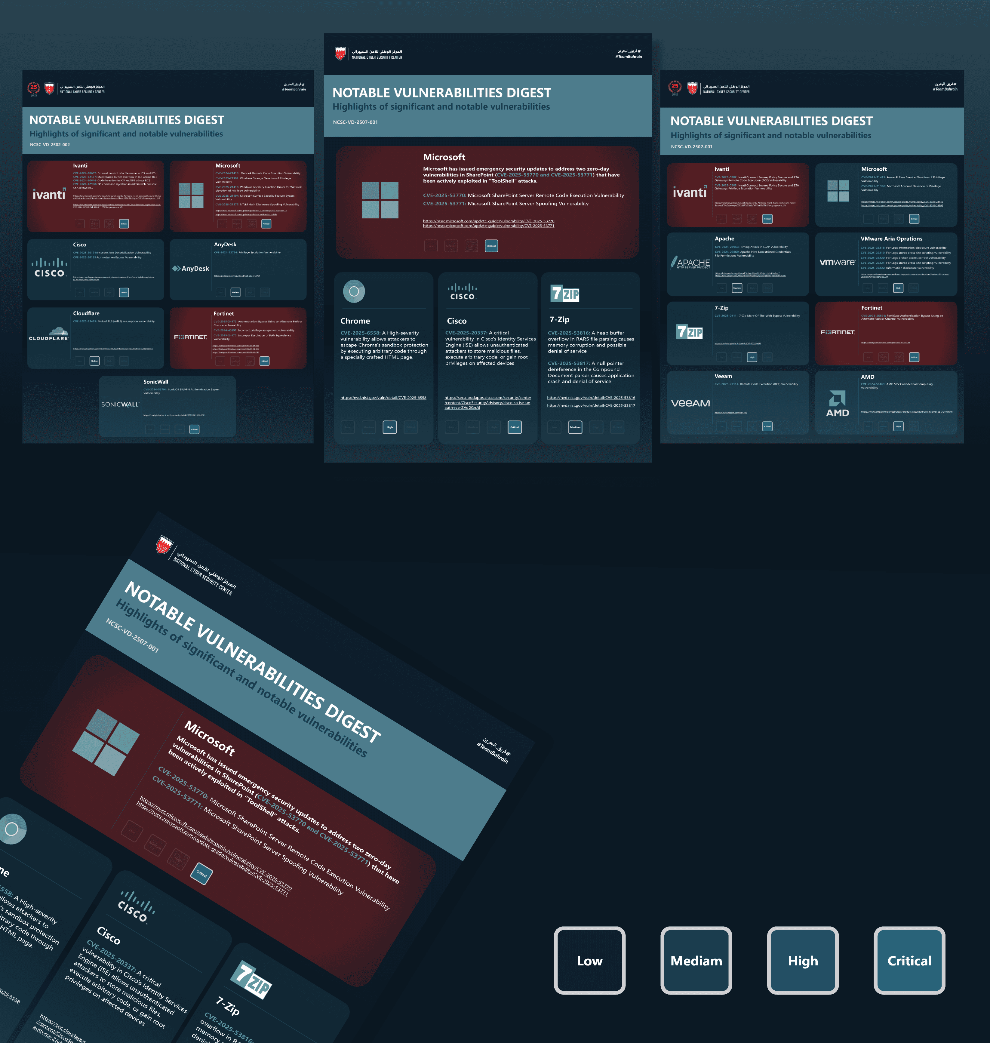
I developed a strategic color system using a muted red to highlight high-priority items. By pairing this with a monochromatic palette, I maintained a professional tone that ensures clarity and prevents visual distraction, especially when featuring multiple brand logos.

Vulnerabilties
I used a layout with dedicated boxes to improve scannability and accommodate varying content lengths without clutter. To represent criticality, I developed a visual hierarchy using opacity, highlighting the active threat level while dimming others. This allows users to immediately identify threat severity at a glance rather than reading through dense text.
Threat Advisery
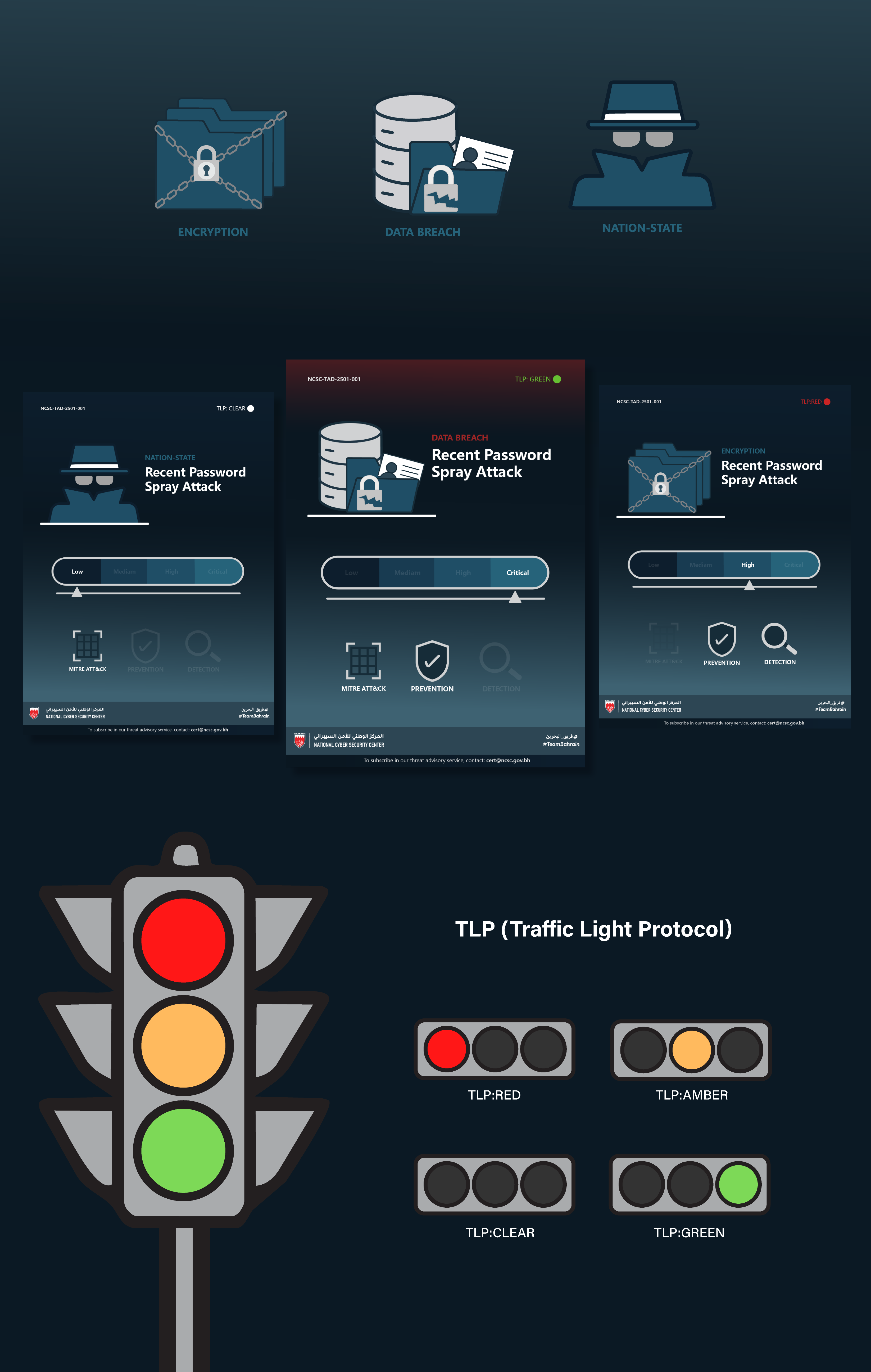
I developed three threat advisory infographics using custom illustrations and a flexible sliding scale to show threat severity more accurately. The design features a template-based architecture with organized layers, allowing for rapid updates and instant distribution of urgent alerts. To ensure secure information handling, I integrated the Traffic Light Protocol (TLP) at the top of the layout, providing immediate clarity on whether the data is public or private.
